Showing posts with label color. Show all posts

Monday, February 10, 2014

Color Robots - Kindergarten Collage of Shapes

 Kindergarten students created these fun collage robots while learning about shape and reviewing color. 


We started our project by using stamping different sized circles and dots to create a fun background. Students learned that you can paint with more things than a paintbrush. Plastic cups, paper cups, and cotton swabs can be fun painting tools.


Then students identified the shapes they could use in their robots as they painted them with a solid color. 


The next class it was time to put our robots together! Students glued their shapes in place, added details and embellishments with oil pastels, pipe cleaners, sequins, and plastic caps. Oh What Fun!!


This Robot is jumping for joy!!


Monday, January 27, 2014

Tints and Shades With a Cherry On Top

4th Graders create a delicious project while learning about tints and shades. 
Blue Raspberry Mint Chocolate Smurf
Students discussed how to change a color's value - to make it lighter and darker. As we discussed what would happen if we added white or black to a color, I demonstrated by mixing the colors and painting on a 12x18 paper that was divided up into 7 sections.

Students then chose their color and paired up to share paint. They were given their color + black & white. We divided up the paper and students made little notes on each section if they thought they would need the refresher of what colors they were creating.
This was my guide that I hung up for them to see -


Students spent the next two classes putting together their ice cream cones. They first made a stencil for the scoop of ice cream from tagboard to make them all similar in size. We discussed how we liked them better constructed - dark to light or light to dark. Most decided they liked the look of dark to light because the lightest tint looked great next to the darkest shade of the cone. Some chose to go light to dark. They were able to add some sequin "sprinkles" and had to come up with a name for their flavor. 


See more of our finished ice cream cones on Artsonia -> Tints & Shades with Cherry on Top 


Monday, December 30, 2013

Think Dots As a Formative Assessment

Color Think Dots - used as a formative assessment for third grade

My third grade students were finishing a project at different stages. Since I have only 6 iPads for my students to use, we often work on multiple projects when it involves using them. Third grade students were typing in their Color Letters (Post to come later on this creative project!) as they finished up on the drawing part of the project. I assigned this Think Dots sheet for students to work on as they waited for their turn on one of the iPads or when they finished. This both gave them something to do that reviewed their color knowledge and showed me where we still needed to focus our learning. Since it involved painting and rolling dice - they were into it. 

Each table was given a laminated Think Dots sheet (laminating will save it for use over and over again) and a die. They were showed how to fold a 12x18 paper into 6 sections. They were to roll the die and do what was asked of them on the Think Dots sheet. They could re-roll but eventually all tasks should be completed. Generally in a Think Dots activities, there are varying levels of difficulty or thinking. The task contained lots of choices that let the students show their creativity. 
For example - "Paint a design in a section using Primary colors." This gives students the opportunity to paint anything they wish. 

When students are finished with these, I will be able to look them over and gather data on how many students completed each task correctly. That data will guide my teaching on the next lesson we do. If all students have mastered most tasks then we can move on to a new concept. I may find that many students still need some extra time learning a certain concept. 

You can find my Color Think Dots here if you wish to borrow. 


Thursday, October 3, 2013

Color Experiments

In my quest this year to allow students as much creative expression and freedom within the boundaries of learning outcomes I felt a new approach to our color unit in my upper-elementary classes was in order. Instead of going over the color wheel as a lesson to introduce our color unit, I decided to give the students a chance to experiment and explore color mixing on their own before we even discuss Primary, Secondary, Intermediate, Warm, Cool,....and all the other color schemes we want our students to understand and be able to use in their artwork.

So much fun! The kids loved it and I loved hearing their conversations as they worked. "Hey, I just made sea green!" "Ewwww....this looks like my baby brothers diaper!" "How did you make that color? That is so cool!"

Some students chose to just paint blobs or lines as they mixed while others thought about using their mixed colors to paint images. They all were sad when clean up time arrived but by then they had used most, if not all, of the paint on their palette.


Tuesday, January 8, 2013

Grant Wood Inspired Landscape Collages


3rd Grade students created these painted paper collage works inspired by Grant Wood. 

The concept of Intermediate colors (Tertiary colors) has been one that my students sometimes have a tough time getting. I would go over the color wheel with them, but we didn't spend much time on it. This year I decided to try something a bit different with my Grant Wood landscape collage project. We spent a couple art classes making painted papers (which students love to do!). I had students pair up so that they could work together. They chose a primary and a secondary color by it to mix into an intermediate color. They mixed the color together on a paper plate and each painted a paper. They used some painting combs or craft sticks to draw some texture into the paint before putting it on the drying rack. The goal was for each pair to mix all six intermediate colors in the two painting classes.


Once we had our papers painted, the students took a look at landscape paintings by Grant Wood. We talked about his use of overlapping and shape. They chose a construction paper for the "sky" color and began to cut and put together their own landscape collage. I encouraged student to split their papers in half (the long way) and trade one of the halves with another student so they would have even more variety for their collage.

The finished projects were awesome!
Check out more of them on Artsonia - Washington Elementary and


See how we took these artworks to a new level using iPads. We added words to our images. See my post "iPad Art - Words and Landscapes"


Saturday, October 27, 2012

Color Wheel Eyes

A upper-elementary project combining Art, Science, 
and even Math!


My 4th and 5th grade students enjoyed this project. They all were quite successful with it!

We spent one art class learning a little about the human eye. Students learned to identify the sclera (the white part of the eye), the iris, and the pupil. We also discussed the lines and shapes of the eye lid, brow, and lashes. We started drawing an enlarged eye by tracing a circle stencil I made from tagboard. Since we were going to do a color wheel on the iris, I wanted students to start with a good circle that was the same for everyone. I guided students in sketching out the rest of the eye.


The next class we spent some time dividing the circle of the iris into 12 sections. We had a bit of a math lesson on fractions during this process. Some of my classes were better at it than others, but all accomplished what they needed to do. We also reviewed how Primary colors mixed to make Secondary and then Intermediate colors. We lightly marked out what color went where on the color wheel and I demonstrated mixing and painting the color wheel in the iris.

The following art class most students were able to complete painting the color wheel and most of the black painting. A few finishing touches were added the first 10-15 minutes of the next class before we started our next project.

Here are a few finished student examples - 


Thursday, December 1, 2011

Miro Inspired Geometric & Organic Shapes- Third Grade

I've had a wonderful student teacher, Kim Doubler, these last 8 weeks. I'm sad to say that tomorrow is her last day with me. She has done a great job and I know that there are students out there who will soon benefit from having her as their art teacher. She brings enthusiasm, caring, and great knowledge of her content area to the classroom. I have a feeling I'm going to be caught talking to myself in the next few weeks because I've gotten used to having another adult in the classroom to discuss ideas with!

As part of her student teaching, she had to create a unit that consisted of 2-3 lessons. She decided to target this unit to third grade students.

The first project in this unit was a Joan Miro inspired painting that reviewed geometric and organic shapes as well as primary and secondary colors.
Students were introduced to the artist and his works and discussed the difference between geometric and organic (or free-form) shapes. They drew shapes inspired by Miro's paintings. They were then instructed to paint in the shapes using watercolors. Students also reviewed the primary and secondary colors as Miss Doubler instructed the students to paint the shapes using the three primary colors and just one secondary color. They could repeat any of these colors but were limited to just those four colors.
Once the shapes were painted in the students used black paint to outline the shapes and add some extra lines for interest.

The results were great! There was quite a variety of compositions among the students. Some students attempted to use the shapes to create images of things while others simply enjoyed the randomness of placing shapes any way.


Great project from a great teacher - Good luck in all your endeavors Kim!
I will share the other two lessons in Kim's unit in posts to come.

Tuesday, November 15, 2011

What a Delicious Project!

Tints and Shades with a Cherry on Top
This project has made it's way around Pinterest and I can see why! Immediately when I saw this I knew I was going to do it with my 4th graders. It's an excellent and fun way to teach about tints and shades.

We did a fairly large ice cream cone using 2 12x18 papers to paint on. This could be done by using only one 12x18 paper with smaller painted sections - but I liked the large finished cones and so did the kids!

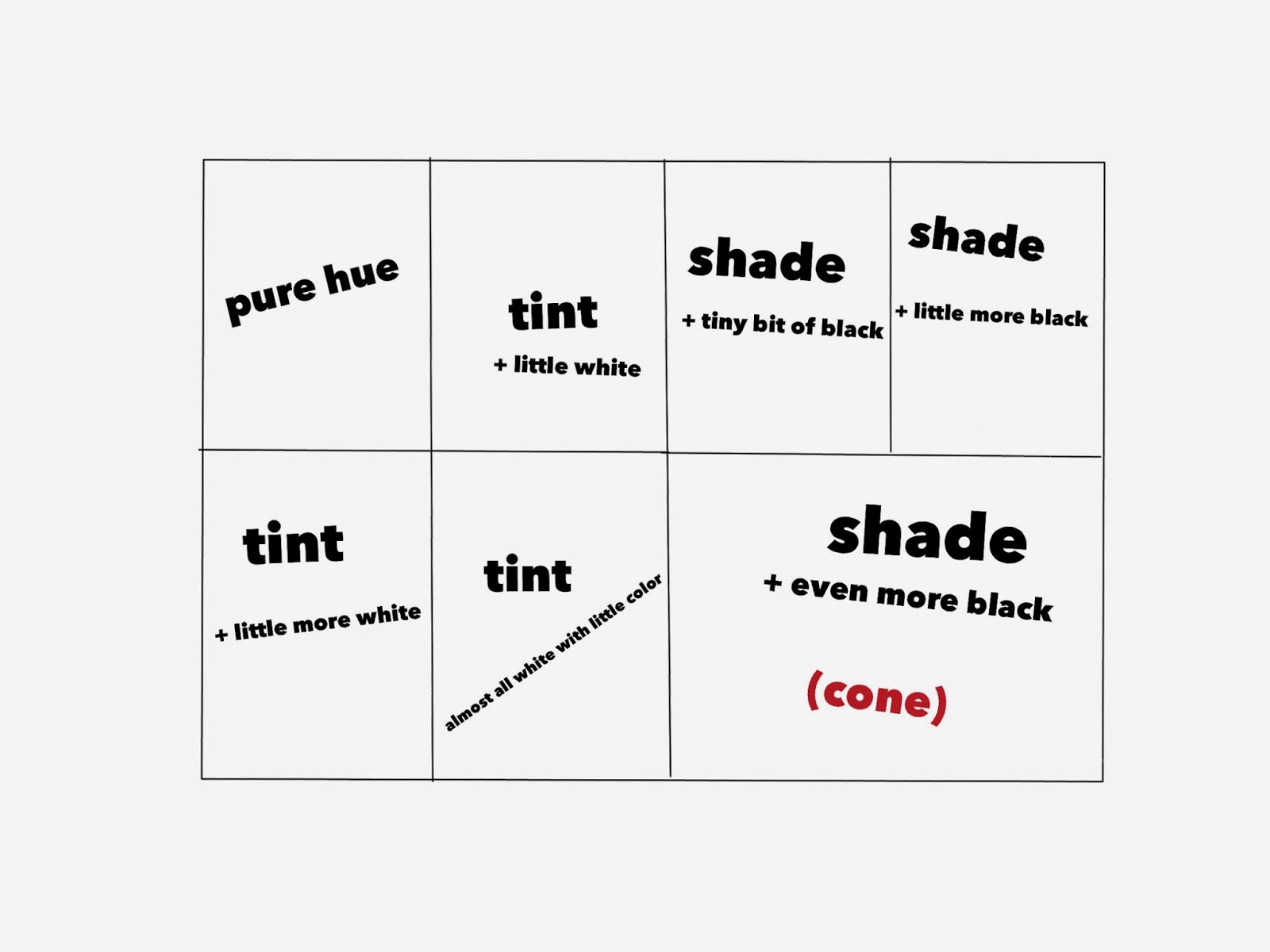
We spent the first class period discussing what tints and shades were. I had students divide a 12x18 paper into 4 sections. We painting one section with the pure hue they had chosen. Then I demonstrated how to create 3 different tints in the other sections.

The next class was spent doing the shades. This time we divided the paper into 3 sections - 2 just like the tints and 1 twice that size for the cone. I demonstrated how to create a shade by adding a little black to the color and then another one with a little more black. The last section - the largest one - was for a very dark shade of the color.
As students waited for the paper to dry they were given a piece of tagboard to create a stencil for the ice cream scoops. This was important so that all the scoops would be similar in size. If time remained students used the stencil to trace and cut out scoops of ice cream from the first painted paper.

The last class was spent finishing cutting the scoops of ice cream, creating the cone, putting it all together in order, and adding a cherry and sprinkles. Students used black marker to draw the cone outline and lines before they cut them out. We, (my wonderful student teacher and myself) had students pick sequins that matched the color they had chosen.
Students finished the project by developing a flavor name for their ice cream. They were encouraged to create a unique flavor and were not to discuss it so that students would "borrow" other's ideas. I posted the flavor under the ice cream.
They are all so great!