Showing posts with label tints and shades. Show all posts

Monday, January 27, 2014

Tints and Shades With a Cherry On Top

4th Graders create a delicious project while learning about tints and shades. 
Blue Raspberry Mint Chocolate Smurf
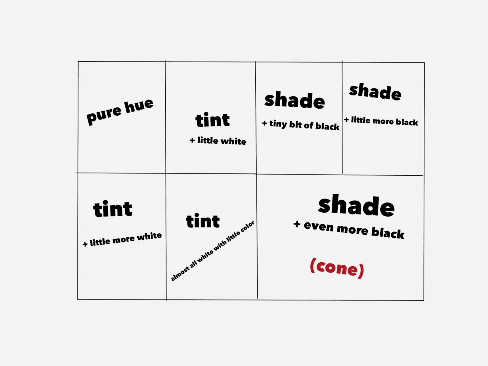
Students discussed how to change a color's value - to make it lighter and darker. As we discussed what would happen if we added white or black to a color, I demonstrated by mixing the colors and painting on a 12x18 paper that was divided up into 7 sections.

Students then chose their color and paired up to share paint. They were given their color + black & white. We divided up the paper and students made little notes on each section if they thought they would need the refresher of what colors they were creating.
This was my guide that I hung up for them to see -


Students spent the next two classes putting together their ice cream cones. They first made a stencil for the scoop of ice cream from tagboard to make them all similar in size. We discussed how we liked them better constructed - dark to light or light to dark. Most decided they liked the look of dark to light because the lightest tint looked great next to the darkest shade of the cone. Some chose to go light to dark. They were able to add some sequin "sprinkles" and had to come up with a name for their flavor. 


See more of our finished ice cream cones on Artsonia -> Tints & Shades with Cherry on Top 


Tuesday, November 15, 2011

What a Delicious Project!

Tints and Shades with a Cherry on Top
This project has made it's way around Pinterest and I can see why! Immediately when I saw this I knew I was going to do it with my 4th graders. It's an excellent and fun way to teach about tints and shades.

We did a fairly large ice cream cone using 2 12x18 papers to paint on. This could be done by using only one 12x18 paper with smaller painted sections - but I liked the large finished cones and so did the kids!

We spent the first class period discussing what tints and shades were. I had students divide a 12x18 paper into 4 sections. We painting one section with the pure hue they had chosen. Then I demonstrated how to create 3 different tints in the other sections.

The next class was spent doing the shades. This time we divided the paper into 3 sections - 2 just like the tints and 1 twice that size for the cone. I demonstrated how to create a shade by adding a little black to the color and then another one with a little more black. The last section - the largest one - was for a very dark shade of the color.
As students waited for the paper to dry they were given a piece of tagboard to create a stencil for the ice cream scoops. This was important so that all the scoops would be similar in size. If time remained students used the stencil to trace and cut out scoops of ice cream from the first painted paper.

The last class was spent finishing cutting the scoops of ice cream, creating the cone, putting it all together in order, and adding a cherry and sprinkles. Students used black marker to draw the cone outline and lines before they cut them out. We, (my wonderful student teacher and myself) had students pick sequins that matched the color they had chosen.
Students finished the project by developing a flavor name for their ice cream. They were encouraged to create a unique flavor and were not to discuss it so that students would "borrow" other's ideas. I posted the flavor under the ice cream.
They are all so great!

Wednesday, November 2, 2011

Moon & Trees with Tints and Shades

5th Grade students worked with tints and shades while creating these beautiful paintings.

This was another idea found on Pinterest....yes, I know - I'm a thief! This was a quick 2 day art lesson - but may have even been done in less. After doing our color wheel worksheet and then discussing tints and shades, student were given blue and white paint. They began by painting a white moon towards the center of the painting. Then gradually created tints by adding a touch of blue to the white, then a bit more, and so on until the sky was completely painted. 
The second class we discussed what a winter or late fall tree would look like after the leaves have fallen off. We also discussed atmospheric perspective. Students were given blue and black this time. They painted the trees using different shades of blue - the darkest one large so it looked up close and smaller ones with lighter shades to look farther back.

The results were great! Definitely a keeper lesson!